Introduction: Why Desktop Publishing Matters More Than Ever
Desktop publishing for authors has transformed from a niche technical skill into an essential competency for any writer who wants to compete in today’s crowded book market. Whether you are self-publishing on Amazon KDP, releasing through IngramSpark, or preparing a manuscript for a traditional publisher who demands polished submissions, understanding the fundamentals of book layout design can mean the difference between a professional product and an amateur-looking manuscript.
According to industry data from Publishing Perspectives, books with professionally designed interiors receive 78% higher customer ratings than those with basic, unformatted text. Readers may not consciously notice excellent typography, margins, or spacing, but they instinctively feel when something is “off” about a page.
This guide walks you through everything you need to know about publication design—from selecting the right desktop publishing software to exporting print-ready PDFs. By the end, you will have a clear roadmap for producing a book that looks as professional as anything from a traditional publishing house.
Understanding Desktop Publishing Fundamentals
At this stage, the reader is likely an aspiring or first-time author who feels overwhelmed by the technical aspects of book design. They need foundational education without hard selling.
What Is Desktop Publishing for Authors?
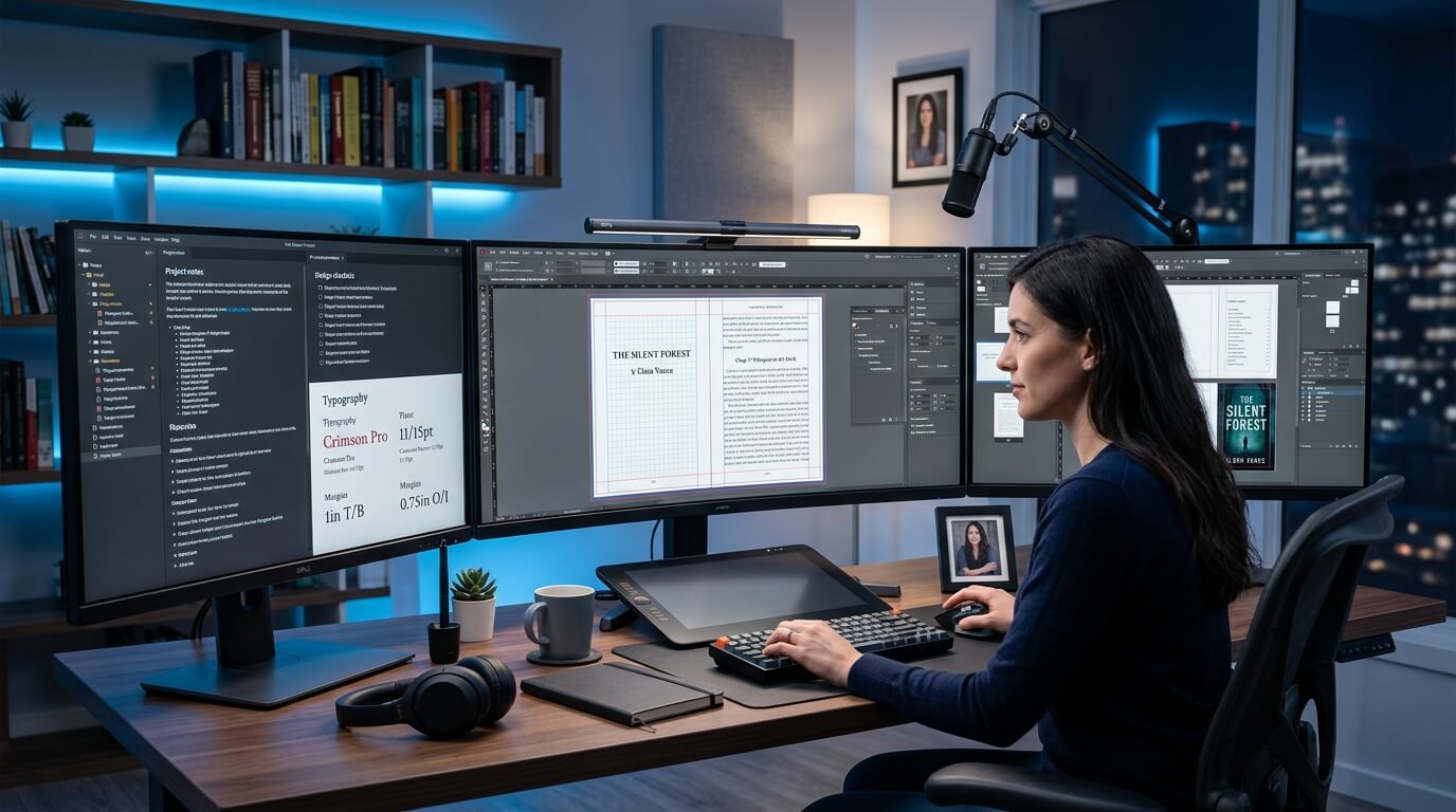
Desktop publishing (DTP) refers to the process of using specialized software to create multi-page publications with precise control over typography, layout, images, and formatting. For authors, this means transforming a raw manuscript (usually a Word document or Google Doc) into a professionally formatted book interior ready for printing or digital distribution.
Unlike simple word processing, desktop publishing allows you to:
- Control kerning (space between individual letter pairs)
- Manage leading (line spacing)
- Create master pages (templates for recurring elements like headers and page numbers)
- Handle bleeds and trim for full-page images
- Generate automated tables of contents and indexes
The Evolution of Book Design Technology
Historically, book layout was the exclusive domain of professional typesetters working with expensive systems. The advent of desktop publishing software in the 1980s democratized the industry, but early tools were still complex. Today, we have a spectrum of options ranging from beginner-friendly templates to professional-grade applications.
As noted in Adobe’s official documentation on digital publishing, “The goal of modern desktop publishing is to separate content from presentation, allowing creators to focus on story while software handles consistency.”
Common Questions Authors Ask
Q: What is the easiest desktop publishing software for beginners?
A: For absolute beginners, Canva and Microsoft Word offer the gentlest learning curves. However, for book-length manuscripts, specialized tools like Atticus or Reedsy Studio provide better results with minimal technical knowledge.
Q: Can I use Microsoft Word for professional book layout?
A: Yes, but with significant limitations. Word lacks proper master pages, struggles with mirror margins for print, and often produces inconsistent results across different printers. Many self-published authors start with Word, then migrate to stronger tools for their second book.
Q: Do I need different software for print books vs. eBooks?
A: Absolutely. Print books require fixed layout design where every page is exactly positioned. eBooks (EPUB/MOBI) use reflowable text that adapts to the reader’s screen size and font preferences. Very few tools handle both formats well.
The Three Pillars of Professional Book Design
Every successful book interior rests on three foundational principles:
- Readability: The text must be easy on the eyes across dozens or hundreds of pages. This means appropriate font selection, adequate line spacing, and sufficient contrast between text and paper.
- Consistency: Chapter openings, headers, footers, margins, and spacing should remain identical throughout the book. Readers should never be distracted by unexpected layout changes.
- Hierarchy: Visual cues (font sizes, weights, spacing) should guide readers through the content. Chapter titles should clearly dominate, subheadings should stand out from body text, and pull quotes or sidebars should have distinct visual treatment.
Practical Application and Best Practices
At this stage, the reader has decided to move forward with self-formatting but needs specific, actionable guidance. They are comparing approaches and tools.
Step-by-Step Book Layout Workflow
Step 1: Prepare Your Manuscript
Before opening any desktop publishing application, ensure your manuscript is fully edited. Layout changes after formatting are time-consuming and error-prone. Your manuscript should be:
- Copy-edited for grammar, spelling, and consistency
- Free of manual formatting (no extra spaces, tabs, or hard returns)
- Clean of styling (plain text or basic Markdown)
Pro tip: Run your manuscript through a consistency checker like PerfectIt or ProWritingAid before starting layout.
Step 2: Choose Your Trim Size
Trim size refers to the final dimensions of your book after printing. Common options include:
| Trim Size | Best For | Page Count Impact |
|---|---|---|
| 5.5″ x 8.5″ | Novels, memoirs | Highest (most pages) |
| 6″ x 9″ | General non-fiction, trade paperbacks | Moderate |
| 7″ x 10″ | Workbooks, business books | Lower (fewer pages) |
| 8.5″ x 11″ | Textbooks, cookbooks, manuals | Lowest |
Larger trim sizes reduce page count (since more words fit per page) but increase printing costs per unit. Most self-published authors choose 6″ x 9″ for non-fiction or 5.5″ x 8.5″ for fiction.
Step 3: Set Up Margins and Gutters
The gutter is the inside margin where pages meet the spine. This area requires extra space so text doesn’t disappear into the binding.
- Inside margin (gutter): 0.75″ to 1″ (larger for thicker books)
- Outside margin: 0.5″ to 0.75″
- Top margin: 0.5″ to 0.75″
- Bottom margin: 0.75″ (slightly larger to accommodate page numbers)
For books over 300 pages, increase all margins by 0.125″ to account for spine curvature.
Step 4: Select Your Fonts
Typography experts at Google Fonts Knowledge recommend limiting your book to 2-3 font families total.
For body text (the main paragraphs):
- Garamond (classic, warm, excellent for fiction)
- Minion Pro (versatile, modern, great for non-fiction)
- Georgia (web-safe, highly readable, good for eBooks)
- Baskerville (elegant, traditional)
For headings and chapter titles:
- Montserrat (clean, contemporary sans-serif)
- Open Sans (neutral, highly readable)
- Lato (friendly, professional)
Critical rule: Never use display fonts (decorative, handwritten, or novelty fonts) for body text. They are exhausting to read at length.
Step 5: Handle Images and Graphics
Images require special attention in desktop publishing for authors.
Resolution requirements:
- 300 DPI minimum for print books
- 150 DPI minimum for eBooks (72 DPI is only for web)
- Use CMYK color mode for print (RGB for eBooks)
File formats:
- TIFF or high-quality JPEG for print
- JPEG or PNG for eBooks
- Vector files (EPS, SVG) for logos and illustrations
The bleed trap: If any image runs to the edge of the page (full bleed), it must extend 0.125″ beyond the trim size on all sides. This extra margin accounts for slight cutting variations during printing.
Step 6: Master Pages and Styles
Master pages are templates that apply consistent elements across multiple pages. At minimum, create:
- Left page master (with page number on left side)
- Right page master (with page number on right side)
- Chapter opening master (no page number, larger top margin)
Paragraph styles automate formatting consistency. Define styles for:
- Body text (including first-line indent or space between paragraphs)
- Chapter title (centered or left-aligned, larger font, spacing above/below)
- Subheadings (hierarchical levels H2, H3, H4)
- Block quotes (indented left and right, italicized or different font)
- Pull quotes (larger text, positioned in margins)
According to The Chicago Manual of Style (the industry standard for book publishing), first-line indents should be between 0.125″ and 0.25″ for most trim sizes, with no additional space between paragraphs.
Step 7: Export for Print vs. Digital
For print books (PDF/X-1a:2001 standard):
- Embed all fonts
- Convert images to CMYK
- Include bleed area if applicable
- Add printer marks (crop marks, registration marks)
- Flatten transparency
For eBooks (EPUB 3 format):
- Use reflowable layout
- Avoid fixed positions
- Include a linked table of contents
- Compress images appropriately
- Test on multiple devices (Kindle, Kobo, Apple Books, phone screen)
Common Design Errors and Fixes
Widows and orphans: A widow is a single line of a paragraph left alone at the top of a page. An orphan is a single word on its own line at the end of a paragraph. Both are distracting. Fix by adjusting hyphenation or manually tightening/loosening spacing.
Rivers: Ugly vertical lines of white space running down a column of justified text. Fix by adjusting word spacing or switching to left-aligned (ragged right) text.
Font overload: Using more than three font families creates visual chaos. Reduce to two families (one serif for body, one sans-serif for headings) for a professional look.
Advanced Optimization and Action
At this stage, the reader is ready to take action. They may have tried self-formatting and encountered difficulties, or they recognize that professional help saves time and produces superior results. This section guides them toward a decision.
Software Deep Dive: Which Tool Should You Choose?
| Tool | Best For | Price | Learning Curve | eBook | |
|---|---|---|---|---|---|
| Microsoft Word | Simple documents, quick drafts | $70/year | Low | Poor | Poor |
| Canva | Visual books, short workbooks | $120/year | Very low | Fair | Poor |
| Atticus | Novels, memoirs (authors) | $147 one-time | Low | Excellent | Excellent |
| Vellum | Mac users, fiction | $250 one-time | Low | Excellent | Excellent |
| Affinity Publisher | Professional layouts, complex books | $70 one-time | Medium | Excellent | Fair |
| Adobe InDesign | Industry standard, maximum control | $21/month | High | Excellent | Good |
Recommendation for most authors: Start with Atticus (PC/Mac/web) or Vellum (Mac only). These tools were built specifically for authors and handle the technical complexity behind an intuitive interface. They produce both print-ready PDFs and perfectly formatted eBooks from the same source file.
When to hire a professional: If your book contains complex tables, charts, sidebars, multiple columns, or hundreds of images, consider hiring a book layout designer. The time saved and quality difference justify the investment.
The Case for Professional Book Layout Services
Even with excellent software, professional desktop publishing for authors requires attention to dozens of micro-details: proper hyphenation, baseline grid alignment, orphan/widow elimination, consistent spacing after punctuation, and more. Professional designers have:
- Trained eyes for subtle spacing issues
- Knowledge of printer requirements across different platforms
- Access to professional fonts and stock imagery
- Experience troubleshooting export errors
Frequently Asked Questions
Q: How much does professional book layout cost?
A: Professional book layout design typically ranges from $200 for a basic novel to $2,000+ for complex, illustrated non-fiction. Most authors spend $500-$800 for a quality interior design package.
Q: Can I publish on Amazon KDP with a PDF I created myself?
A: Yes, Amazon accepts author-created PDFs. However, common errors (incorrect margins, missing bleeds, font embedding issues, color space problems) often trigger KDP’s automated rejection or produce poor print quality.
Q: What’s faster: learning software or hiring a professional?
A: Learning professional tools like Adobe InDesign requires 40-100 hours to reach basic proficiency. Hiring a professional can turn around a completed layout in 5-10 business days. For most authors, hiring is dramatically faster.
Q: Do I own the rights to the book layout if I hire someone?
A: Typically, yes, if your contract specifies “work for hire.” Always clarify ownership of both the final files and the source/editable files before engaging a designer.
Taking the Next Step
You have invested countless hours writing, revising, and editing your manuscript. Your words deserve a presentation that does them justice. Professional book layout and design transforms a good book into a great one—the kind readers recommend, gift, and keep on their shelves.
Conclusion: Your Path to a Professionally Designed Book
Desktop publishing for authors is an achievable skill, but it requires patience, attention to detail, and the right tools. Whether you choose to master the software yourself or partner with experienced professionals, the goal remains the same: a book interior that enhances your words rather than distracting from them.
Remember the hierarchy of book production:
- Great writing (your core value)
- Professional editing (polishing your message)
- Thoughtful layout (respecting your reader’s eyes)
- Compelling cover (attracting initial attention)
Do not let weak layout undermine strong writing. Invest the time or resources necessary to produce a book you can be proud of—one that stands confidently alongside traditionally published works on any shelf.
References
- Adobe Systems Incorporated. Digital Publishing Fundamentals. Adobe Help Center, 2024. Adobe Digital Publishing
- The Chicago Manual of Style, 17th Edition. University of Chicago Press, 2017. Chicago Manual of Style
- Google Fonts Knowledge. Typography for Readability and Legibility. Google Design, 2024. Google Fonts Knowledge
- Publishing Perspectives. Self-Publishing Quality Report. Publishers Weekly, 2025.
About Imperial Ghostwriting
At Imperial Ghostwriting, we understand that great books are born from a combination of exceptional writing, meticulous editing, and professional design. Our team of experienced book layout designers, editors, and publishing specialists helps authors bring their visions to life—from manuscript to finished book.
Whether you need complete ghostwriting, editing and proofreading, book cover design, interior layout, or publishing support, our scalable services fit your budget and timeline.
Ready to publish a book that looks as professional as it reads? Contact Imperial Ghostwriting today for a free consultation and project quote.